Is there an ongoing effort to update the website - other than maintenance? I really do appreciate its simplicity, but it’s kind of lazy and really has room for improvement.
DeltaChat copies modern messengers UI and appearance for a good reason, dropping the outdated look and adding some polish could go a long way in terms of positive first impressions. Doesn’t have to look like whatsapp.com – but signal.org does a decent job, overall for example. Something similar would look great on DeltaChat, too.
Some has recently opened a few “polish” MRs, but I am not aware of any overhaul plans.
I agree, currently the website looks side-project-esque.
Edit: FYI recently the webxdc.org website got an overhaul. This can serve as an argument for updating delta.chat as well.
That’s the recipe for futile and endless discussions about details of individual opinions. I’m intentionally proposing a vague direction to work towards.
When there is some kind of consensus about the raised concern I’m happy to be part of finding a solution, of course.
I’m not asking for a solution from you or argue with you right now, I’m only interested in your personal opinion with regard to what you would do better.
“…not asking for a solution … only interested in … what you would do better.”
This is why I didn’t want to go into details. This is asking for my solution here, what I would do better, to see if my reservations are valid in your eyes, too. For now, I’d like to postpone those questions, what I would do better is this:
I would minimize difference. Browse Signal or Whatsapp (… or any other messenger), compare it with your experience on delta.chat. Note the difference in how those sites achieve what they do. I’m looking for general consensus to reduce that difference.
As @WofWca pointed out, https://webxdc.org/ is already quite a step further in that regard, for example.
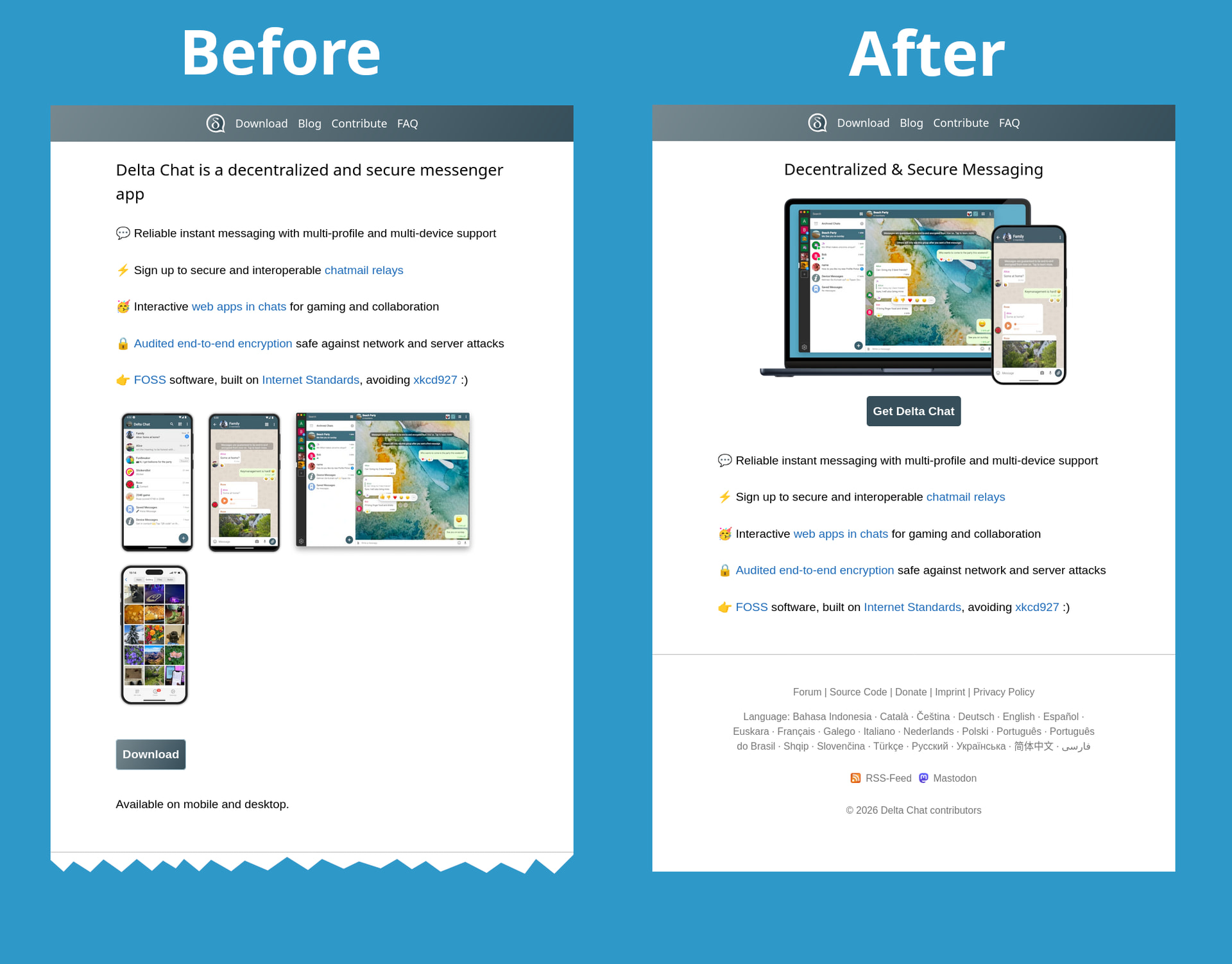
I have created a small patch to improve delta.chat site and make it look more in line with Signal, WhatsApp and Telegram, there is still quite some room for improvement but this is a step forward
Just to say that I trully appreciate current website for its simplicity and because it makes the few essentials links easily available. No scrolling, no links with promising title that just send you a bit bellow the page with no real information, no marketing fluff.
It is just perfectly useful : i’ve immediately found all the information I wanted and still use it as soon as I want to go to this forum.
This website should, in fact, be taught in school at what a website should do and be.
Comparing the current website to the one of a few weeks ago, it is now more difficult to find the forum and more difficult to see detailed screenshots. Are there positive benefits that someone could explain?
The ease of accessing full-resolution screenshots was definitely a positive first impression for me when I visited the website before the change.
I see little to aspire to in signal.org. Delta.chat provides more information without requiring the user to scroll. I also hate that when you do scroll signal.org the navigation bar at the top sticks to the top of the screen instead of showing more of the content you are trying to see.
If the difference between delta.chat, signal.org, and whatsapp.com is to be reduced, I would prefer it to happen the other way: namely signal.org and whatsapp.com should become more like delta.chat! I associate the low-information-density designs of the other two sites with dishonest marketing and instrumentalisation of the user’s attention. I personally feel that Delta Chat’s website should reflect that we have different values!
There isn’t really a way to improve the website: neither is there a clear consensus on possibly dropping the amateurish look, nor seems there to be an orderly way to even get that done. Bummer, but good to know ahead of time.
And on the bright side: among the vocal non-designers there seems to be somebody who somehow got triggered by this post and improved some random bits. Kudos to you @adbenitez you seem to be embedded enough to just have an impact! Keep using that privilege, this project needs it.
sorry to disappoint you, but I improved the website without even knowing this post even existed, got to know about your post because in my pull request / patch @WofWca linked to this thread
and for your information, I find your way of communicating not really useful or productive, you are even a designer yet only bring stuff in a vague meta-level without bringing concrete suggestions or doing anything but more like judging complaining about things, and being rather unfriendly when other users from the community like @ian just asked what would you recommend to improve etc.,
Delta Chat developers in general agree the website needs a lot of love, in part that is why I created that small improvement, without needing you to enlighten me that it was needed, and we all know more is needed, I am just the Delta Chat Android maintainer not a designer or full-time web developer, we don’t have people with a lot of free time to take care of the website, we are all busy with a lot of stuff, and what I did was just a quick improvement sacrificing some of my private free time, we sadly can’t drop all the lot of things going on to focus on the website, but we want to improve it over the time when we can
anyways thanks for at least providing your feedback
If straight non-JS page without stupid stock photos and rounded corners everywhere are amateurish, can we just make the web more amateurish please?
I hate this trend to “look corporate” (which is hideous, useless and, well, corporate). For some reason, designers and executives think that “you have to look corporate” but having done some tests (many years ago) with users, I discovered that non-tech and non-corporate users don’t see a simple website as “amateurish” but as “easy and useful”.
I appreciated the (offtopic?) screenshot, sorry if I wrongly assumed it somehow had anything to do with my post, I had no idea it was completely unrelated and still got posted!
I agree my way of strictly avoiding detailed design discussions might have come along a bit strange. I tried my best to clarify why. I first wanted to get an impression of the situation before sinking lots of time and effort into it. My caution was well reasoned:
Nobody is responsible for design, any workflow to reach consensus is missing, but there is an abundance of critical design related opinions and emotions popping up already – even without proposing anything specific – presumably coming from non-designers of course. It’s getting just too frustrating to contribute in such an environment. For me.
You on the other hand seemingly just push changes that go live somehow.
I’m still honestly interested in how you personally do that, do you have the permission to just do it, or do you have to ask anybody or any group? If so who? What is your process here? What would it be for me?
That said, I realize I stir up things here even before contributing, so I want to be clear: Delta Chat is a great project either way, and I want to thank everybody making it all happen. Thank you!
There does appear to be a lack of formal procedures for decision making in Delta Chat, but it would require administrative overhead that may not be worthwhile for the project at this stage.
I think threads like this do provide an informal workflow for reaching consensus, where discussion can identify points of controversy and agreement. Certainly such a procedure would require participants to reveal their positions and the reasoning behind them, but apparently something about the way this has happened has made you frustrated and unwilling to engage.
Do you have any constructive feedback that would help make this environment feel more welcoming? Because I personally don’t see anything wrong with pro-actively moving the discussion toward specific design choices, or expressing a position on a design choice without self-identifying as a designer. The aim of design after all should be to serve the user.
Just want to add to what @bleb said: there’s nothing wrong with disagreement in such a forum. We could heavily disagree on one topic then agree on an unrelated one. This is not personal.
And I understand that, in your case here, this might be frustrating because the participants in this thread seems to agree on the fact the website is already good and should not be changed while you have opposite views which may go deep into your own feelings and identity.
So, yeah, I understand the frustration but be insured that there’s nothing against you and that I believe it is always worthwhile to launch a discussion like you did. Even if it is frustrating in the short term, I believe civil disagreements always plant seeds in people to make them evolve.
So thanks for posting and sorry for any frustration caused.
Following this thread with great interest I wanna chime in exactly here.
Are you sure the project is still in an “alpha stage”? From my perspective as a multiplicator and issue / workflow contributor (at least in the forum) I would say we are straight on the road to “growth” leaving the “beta status” day by day. Not in the sence of “economical growth” (I don’t like that either) but in the sence of more users are using this messenger and it becomes a real long-term alternative.
As I’m actively spreading the word about it, implementing the messenger wherever it makes sense and talking to people to switch it becomes more important to have processes to discuss and vote on significant changes especially regarding the marketing from my perspective.
The technical base of DC is already great and all the devs are doing a great job here. Thank you all for that. But I also agree with @mray here that there should be a clearly communicated way to improve the way the project communicates itself to the “outside world” (where most people are non-techies).
So I highly vote for having a way to discuss and decide on marketing related stuff (like the website) together – based on facts, not emotions or permissions. Just because every multiplicator (like I am) and person who tells others about the messenger (in)directly points them towards the official resources like the website or the FAQ and I would like to see a way to improve whatever can be improved.
The only constructive feedback I can give is: build an informal workflow of how design is being approached by the project. Because contrary to your view I see huge problems with just pro-actively moving on.
As a bystander it is easy to just watch and see how people work on designs, posting “pretty things” and then having a vote among just the people that dare to keep up with a verbose thread that basically revolves around differences in taste, and arguments how one does not have to be a designer to have a valid opinion. The ultimate climax to this waste of effort and time is of course the “contest” where AS MANY proposals as possible are made and AS MANY people as possible vote on it.
Never mind all the work going to waste.
Never mind losing actual design thinking that imbues itself in way more aspects than the current screenshot.
Any designer worth that description is well aware of the clear distinction of own taste and what is needed for the project. That is exactly why some thoughtful discussion around project values need to happen, so that the right goals can get defined. That needs leadership vision and longstanding inside knowledge. You don’t get that in a loud thread where people post eye-candy in competition what pops most among the peers there.
I’d be here to listen and be open to what the project needs, maybe steer and help to find out – but not to pretend to care about every opinion of any person posting anything, accepting that my voice is just as valid as any other. Because if that is the case I’m out. Sounds pretentious, I know - but if I’d be OK with that, everybody is a designer, and therefore nobody.
And with that I feel like I’m already spending too much of every-bodies time again, just flapping my gums.
My frustration isn’t with you @ploum. It is the lack of structure that makes your post and mine echo in a vacuum where we are left alone with just us. I don’t want to have to make you see how you basically attack a straw man, opposing to everything bad that you see in modern “hip” and “mainstream”. I purposefully never made the case for a 4MB javascript-site with, stock photos, rounded corners and anything else that grinds your gears, because you are right. All of that sucks! (Not the rounded corners, depending on the general look )
You write as if your perspective is expressed so often that repeating it would be tiresome. On the contrary I haven’t seen a designer defend modern trends in web design and I am curious what I might learn.
I fear these ills may be closer to hand than we would like to think…
For example, I wanted to see where javascript was first mentioned in this thread, so I tried to Ctrl+F for “java” on this page and my browser showed “phrase not found.” Same thing for “js”. I begrudgingly clicked the javascript-implemented search icon, clicked “in this topic”, and entered “js”, and it said “Your search term is too short.”
But I digress. You did suggest making delta.chat more similar to signal.org and whatsapp.com, and it’s too perfect not to point out that whatsapp.com takes 4.13 MB. signal.org comes in at a lean 2.22 MB. delta.chat is 115 kB – amateur indeed! (I might add that this page is 7.63 MB, of which 6 MB is javascript…)
You will forgive us for fearing that your perspective aligns with the type of designer who would sign off on such bloat, as such people evidently do exist and even manage to get their designs into our forum software! (Apologies for the premature post – for some reason the text box decided to start treating my Enter key as a submit button instead of a newline.)
There were some bumps along the way but it appears we have started to approach a consensus that 4MB is too much for a messenger app landing page, so that is not one of the things about whatsapp.com that we should emulate. I think we would have gotten here faster if you had followed ian’s suggestion to explain what you think would actually be an improvement.
 That’s the recipe for futile and endless discussions about details of individual opinions. I’m intentionally proposing a vague direction to work towards.


 )
)