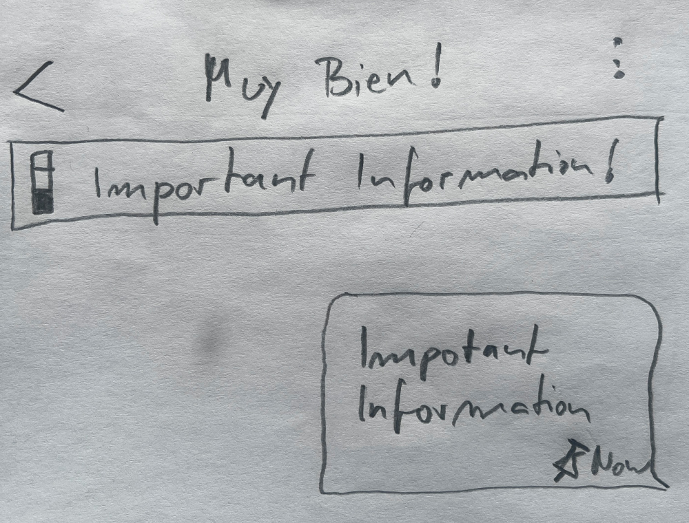
one of the largest change is the long-awaited “Pinned Messages” feature, chatmail/core#8546 references all ongoings, for an overview see FAQ - Delta Chat
Welcome and useful feature! Maybe a drop-down list with possibility to select one pinned message would help when there are approximately more than three pinned messages in the list.
Pinning works perfectly for me in all versions. In DC-iOS, pinned messages can be unpinned directly via a context menu. In the other versions, users must first navigate to the specific message within the chat before they can unpin it. I believe it would be better if this could also be done directly from the top bar, as is the case in DC-iOS.
While testing, I had another idea regarding apps. It might make sense to be able to select multiple apps—sent without accompanying text—simultaneously and pin them together. These could be displayed in a single row, showing only their icons (omitting the names).
Users could launch apps directly via these icons, without having to jump through all the pinned messages. I think this would be particularly useful in chats where several different apps are being used.
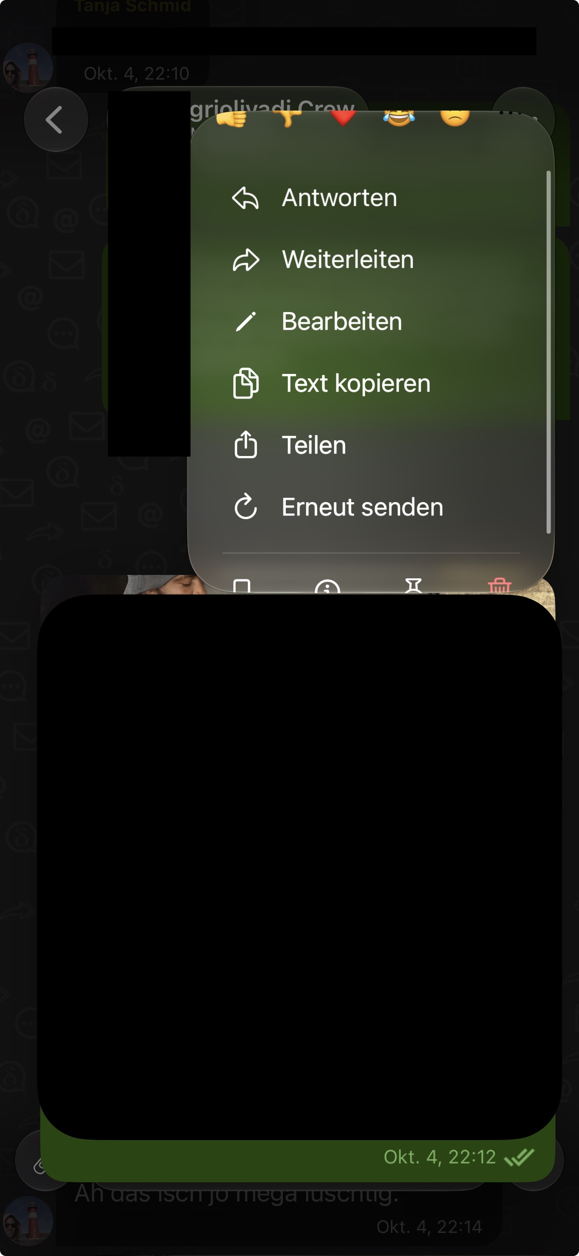
In some situations the redesigned edit menu in iOS is limited in height. As a result, not all features are visible. It seems to me that this happens with images that are a certain height.
the screenshot shows the menu already scrolled? usually, on opening, the first row should be complete, however, iOS may decide to add a scrollbar instead of showing all items.
this is not new and was like that before. and yes, happens mainly on small screens (eg. iphone mini) and if there are more items added (as for self-sent messages or images).
( we aim for fewer items all the time, eg. there are discussions if “Save” could be included to “Forward” again (which would also make it clearer that really a copy is done, this is what eg. telegram/signal are doing). “share” could get its place. and “Resend” might not be needed at some point as well (it is currently mainly needed to resend ones own messages and apps when a new member joins in a group).
until then, one need to live with the scrollbar - unless we have overseen something basic, and it can be fixed by a flag or so (we will not go for non-native menus or so, we want to keep code easy and maintainable and stay with what the system offers wherever possible )
Yes, I scrolled the menu on purpose to get a cleaner screenshot. But that is exactly the problem: nothing indicates that the menu can be scrolled further, so the remaining items are easy to miss.
I tested this on an iPhone 15, not a mini, so it is not limited to the smallest screens.
I understand and support staying with native menus.
 https://download.delta.chat/android/beta/deltachat-gplay-release-2.64.0.apk (google play candidate, overwrites existing installs, should keep data)
 https://download.delta.chat/android/beta/deltachat-foss-debug-2.64.0.apk (f-droid candidate, can be installed beside google play)
 Join the Delta Chat beta - TestFlight - Apple (iOS Testflight, should keep data)
 Index of /desktop/preview/ (macOS, Windows, Linux)
 deltatouch - Codeberg.org (Ubuntu Touch)